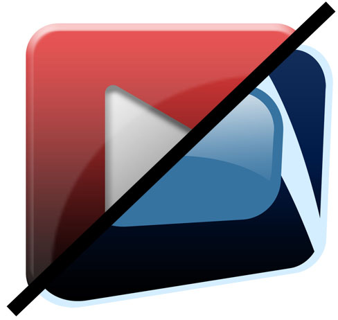
Just wanted to jot down this quick post to update our loyal readers on a small change happening for NextWaveDV. For as long as NWDV has been around, we’ve used a red play button as our logo:

During the last update of YouTube’s website, they have added a new Favicon that is a very close replica of our logo. Now I’m not saying that a red play button is all that unique, but I hate the idea of brand contamination.
With that, I decided to change the NWDV logo over to a logo I designed for DVTV. I think it’s a bit more original and has already been used for close to a year now.

Thanks again for being a part of our community!




Nice and clean. I like it. I also like that you changed the bright blue of the lettering to the gray or slate color.Â
Usually I don’t like change, but that’s pretty slick
The original looks better, this new one is shapes like a TV form the 60s
i like it!
And the new text style too!
Great weblog right here! Additionally your site quite a bit up fast! What host are you the use of? Can I am getting your associate hyperlink on your host? I wish my site loaded up as fast as yours lol
Thanks for sharing. I read many of your blog posts, cool, your blog is very good.