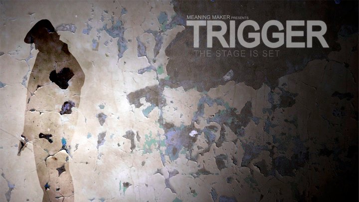
For this next post on “Analyze the Frame” I thought we’d leave Hollywood behind for a very well produced short indie film. TRIGGER is the story of a man who has been running from the law for a long time only to confront a major regret at the end. Feel free to watch the 15 minute short before we continue.
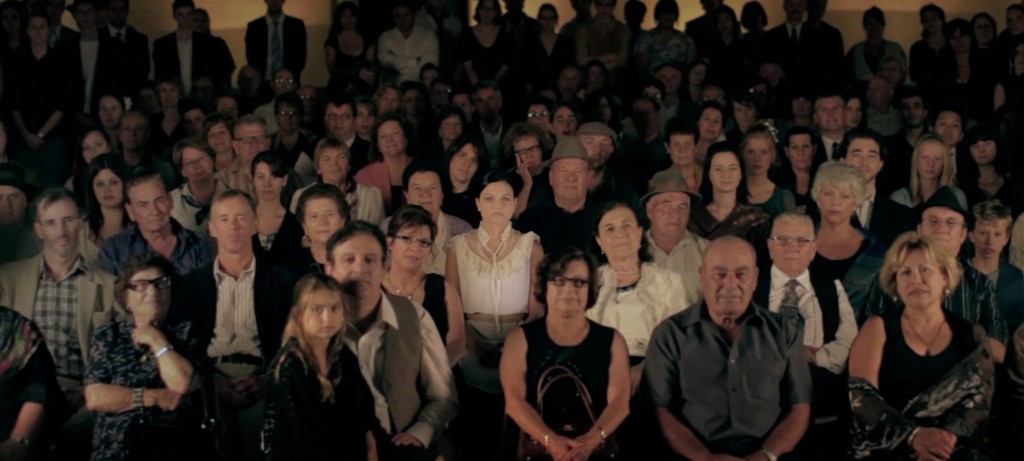
As you can see, the film was shot very well, especially for being an indie film. Many things come together to create a great film including story, acting, cinematography, wardrobe, makeup…etc. Of the many frames we could analyze, the main one I want to look at is this:
If you look at the full size image and have already watched the film, you’ll notice that this frame is the end of a slow dolly in over the piano. Your eyes are gently drawn to the woman in white with black hair. You’re not sure if this is where you should be looking, until the following cut.

We can now know that our attention was supposed to be drawn to her. But in the previous frame, how was this accomplished?
Many factors go into effectively drawing our attention. First one is most important, and that is wardrobe. Notice how she is wearing a lighter and different colored clothing than anyone else around her. Next is composition. She is placed in the center of the frame and the surrounding extras are subtly moved away from her. Next is lighting. Whether done on set or in post, there is a very gradual vignette around her where the light falls off in front, behind and to the right and left. This again draws the eyes to the center.
Another way to use this effect is by rim lighting the subject. While it would perhaps have been too obvious in the above frame, it can be used for distant shots where you want to show the audience where to look. For example, here is a frame from a restaurant commercial I shot using this affect:
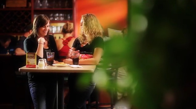
So there are a few techniques you can add to your production to help properly draw your audience’s attention to the correct spot in the frame. If you enjoyed TRIGGER, check out the making of.



https://t.me/s/be_1win/141